Learn about the differences between reflowable and fixed layouts, their uses, and benefits.
The first layout decision you'll need to make for your ebook is whether to create it using fixed layout or reflowable layout. At first glance they may seem similar; however, they are so distinct that you cannot switch back-and-forth midway through your project. So, unlike most layout decisions, this one is final and changing your mind means restarting from the beginning. Kotobee allows you to set the layout for each chapter/page individually, you'll see why in a moment. Let's make sure you understand how each one works, their uses and benefits. We'll also give you examples of the types of ebooks that work best with each layout.
Fixed Layout

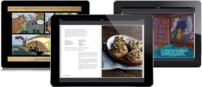
With fixed layout, you will set precisely where everything will be on the page and everything will appear on the page exactly where you place them. Their location will be fixed and will never wrap or change. You can overlap elements or place them side by side and when your readers zoom in or out, it will be like zooming in or out, on a photograph. So, when your readers zoom in, the whole page will expand beyond the borders of the screen. The reader will need to use the vertical and horizontal scroll bars to see the rest of the page.
| Page Width and Length | Fixed. Set by the writer. |
| Element Position | Placed on fixed coordinates, appears exactly where placed |
| Zoom type | Pinch zoom |
| Scroll | Vertical and horizontal scroll bar |
| Text size | Fixed |
| Ideal Usage | Comics, Magazines, Children's Books |
When should I choose fixed layout?
When the layout of the page is critical, especially if your readers will be reading your ebook from a computer, like some LMSs that deny mobile access. If you’re writing magazines, comics, or children’s storybooks, you’ll probably prefer fixed layout.
Reflowable Layout

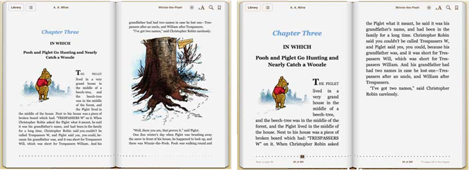
The second type of layout optimizes the content for the viewing screen’s dimensions so that readers simply scroll through each chapter. This option focuses on content, not layout. You will simply determine the order of the contents for each chapter and they will appear in your ebook in the same order. An advantage of reflowable layout is that each user can adjust the font size according to personal preference or screen size, and the layout and interactive content will automatically adapt by wrapping and increasing page length, thus enhancing the user's reading experience, especially on smaller screens. Most blog posts and news articles are reflowable.
| Page Width and Length | Width: Determined by the reader's screen size. Length: Extends to fit the content. |
| Content Position | Sequential |
| Scroll | Vertical scroll bar only |
| Zoom | Text size increases and text flow is automatically readjusted. |
| Text size | Can be increased or decreased by the reader. |
| Ideal Usage | Ebooks that will be read on mobile devices. A precise layout is NOT essential. |
When should I choose reflowable layout?
This is the more popular form of layouts for reading on mobile devices and for a reason, of course, the readers' viewing comfort. If you’re writing a short story or novel, your readers will want you to choose reflowable layout.
Why do we at Kotobee Author allow you to use both layout options in the same ebook?
Because you and your readers want both. Reflowable layout is the most comfortable for your readers, no doubt. But sometimes you’ll want or need to include a design rich page. Like the first page of a history chapter, with an interactive timeline, that extends horizontally. The rest of the chapter will be reflowable to make reading easier. The uses are endless to create the ideal reading experience for your readers.
Choosing your layout in Kotobee Author
When creating chapters in Kotobee Author, you are always asked what type of layout you want to apply.

To prevent being asked every time, simply check the Don't ask again box.
